Visual navigation
VISUAL NAVIGATION
Navigation that guides
Build beautiful top menus, bottom bars, and launchers that help shoppers explore your store better.
 Top menus
 Bottom bars
 LaunchersSide panels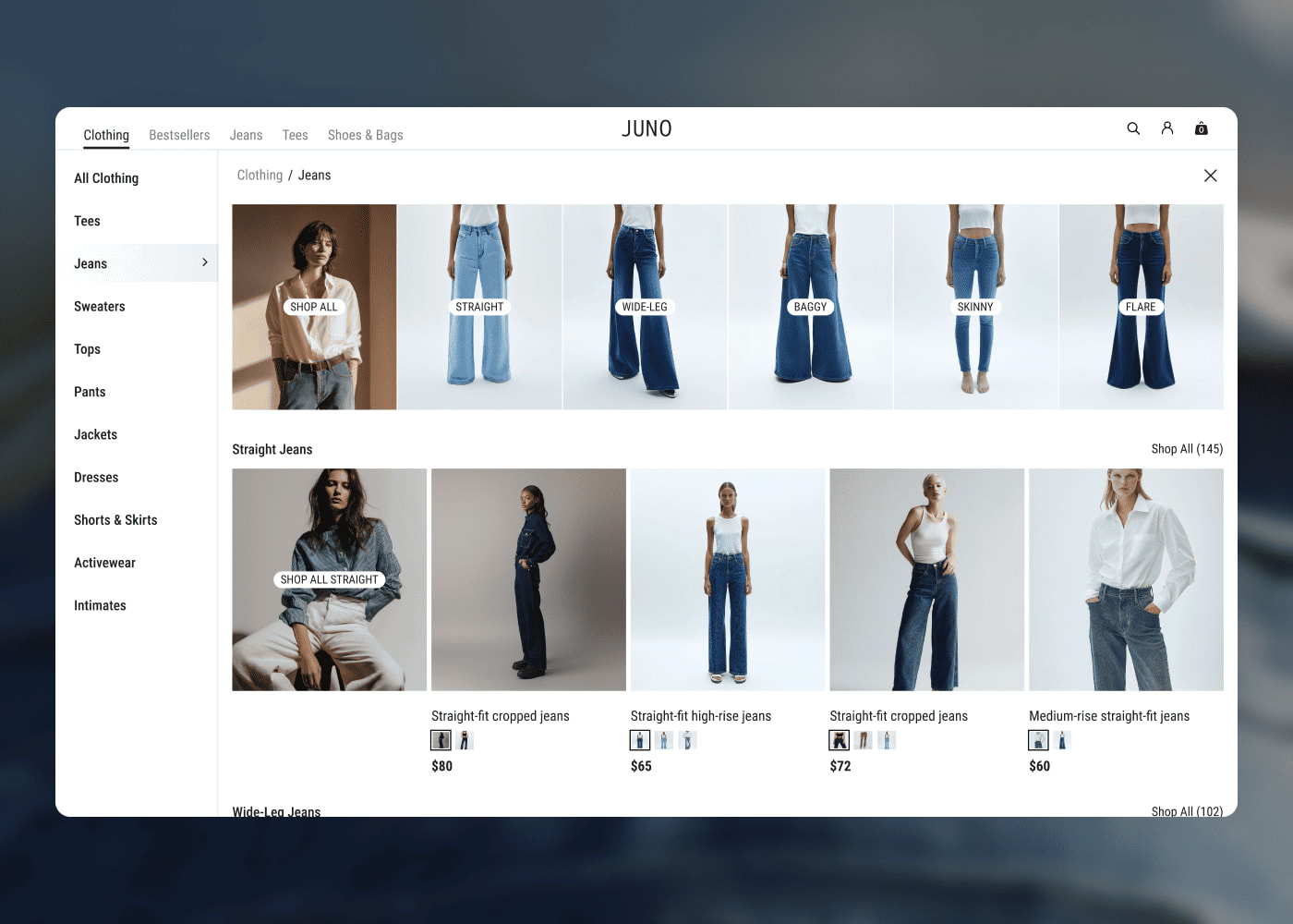
Trusted by teams at


Better navigation at every step
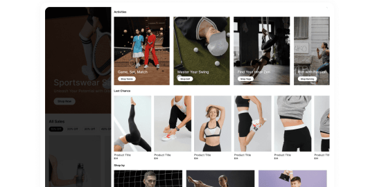
Mega menus that sell, not just link
Replace boring text dropdowns with visual mega menus. Show product images, lifestyle photography, and featured collections directly inside your navigation.
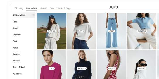
Always within reach
A persistent navigation bar that keeps categories, search, and cart always accessible — desktop and mobile.
Show the right categories at the right time
Floating launchers that promote products, collections, or campaigns without interrupting the shopping experience.

Quick views that keep shoppers in flow
Slide-out panels for product details, collections, or promotions — without navigating away from the page.
Made with Maker


"Maker's features, right out of the box, are genuinely meaningful, boosting sales, viewer engagement, and saving significant effort. It allows us to launch faster and more efficiently into new markets."

Aliyah Hassan Kent
Director of Digital Product at Youngevity
"Maker has streamlined the entire blog creation process for us, we no longer need to spend hours writing code and can easily customise the design to match our preferences."

Ashima Singla
Founder Whispering Homes
"Oh my gosh, this is awesome! There's so much you can create with Maker—it's simple, intuitive, and exactly what we've needed."

James Roe
Digital Marketing & E-Commerce Manager at JEGS
"The seamless Figma-to-web conversion eliminated developer bottlenecks and let us go from design to done—and live—in days rather than weeks or months."

Brian Posalski
VP of Digital, NeoLife
"Maker is a key part of our personalization strategy. It's helped teams deliver immersive customer experiences, partner across departments, and quickly adapt by experimenting and learning more often."

Andrew Boellstorff
Director of Digital Product & Tech, Speedway Motors
"Maker has made it so much easier to improve our website pages. We've seen stronger, clearer content and it saves us so much time."

Sally Sloan
Ecommerce Specialist at Yogasleep
Questions?Answers!
Top mega menus, bottom navigation bars, floating launchers, and slide-out panels. All visual, all customizable, all no-code.
Yes. Every navigation element is responsive. Bottom bars are mobile-focused, mega menus are desktop-first, and launchers work everywhere.
No. Maker navigation overlays on top of your existing site. You can enhance your current nav or add new elements alongside it.
Yes. Show different menus, bottom bars, or launchers depending on the page, category, or audience segment.
Drag and drop. Pick a navigation type, customize the design and content, publish. No code needed.
Yes. Test different menu layouts, bottom bar designs, and launcher placements to find what drives the most engagement.